Tuesday, 26 January 2016

Evaluation 6

The technology we used

Created by Isla Reid
            

Evaluation 5

How did we engage our audience?


Created by Isla Reid


Evaluation 4

Devyani Tailor

Who would be the audience for your media product?

Our target audience
 
Age: 15 - 25 year olds
Gender: Males & females - more for females since the leading role is a female
Target audience's other favourite films: Psycho, Gone Girl, The Girl with the Dragon Tattoo & Panic Room
Social demographics: A-C1
Image result for psycho       Image result for gonegirl    Image result for girl with the dragon tattoo

Young & Rubicam's Audience Classification SystemYoung & Rubicam's system puts different types of audiences into the specific groups that follow:
Explorer - needs new experiences and likes discovery
Aspirer - materialistic, worries about others opinions on them
Succeeder - enjoys control and prestige brands
Reformer - anti-materialistic and intellectual
Mainstream - family values, enjoys value for money and security
Struggler - enjoys eating junk food, alcohol, gambling, and needs to escape from their own lives
Resigned - enjoys tradition, nostalgia and survival.
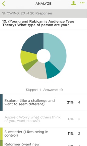
We believe that our target audience could potentially be quite wide. This is because part of them could fit into the explorer or struggler category, these people would not be able to relate to a majority of the characters or the narrative, therefore it would be a different and new experience for them which is different to their lives. However we also think that Two Faced could appeal to the mainstreamer because our opening sequence shows a traditional family doing a conventional birthday celebration. This would provide the audience with something they appreciate (family values) and would also provide security in the fact that they are likely to relate to the family.

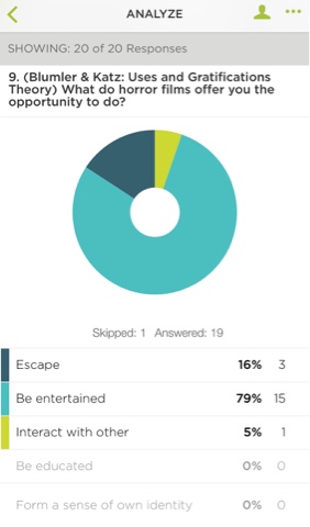
Blumler & Katz's Uses and Gratification TheoryThe uses and gratification theory suggests that audiences use media for different purposes - to escape, for entertainment, education & information, social interaction and identification. We think that our opening sequence would be used by audiences to escape, because it has a narrative involving an extreme outcome from a mental health illness. However this could also be combined with identification because there are many families similar to Ophelia's who are impacted by mental health but in a less extreme / dramatic way.


Richard Dyer's Utopian Solutions TheoryThis theory suggests that audiences use the media to experience perfection which they can't get from their real lives. This means that media products offer 'utopian solutions' to the audience's problems or 'social tension'. for example; confusion - clarity, exhaustion - energy and dreariness - intensity. We think that our opening sequence would full fill the intensity solution because Two Facedshows a very ordinary equilibrium, but has an extreme plot twist which would create energy and shock to combat the dreariness they may experience throughout their own lives.
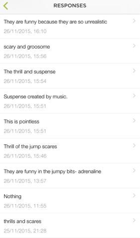
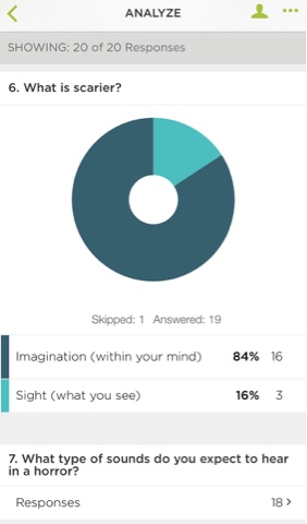
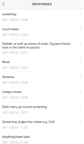
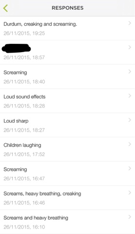
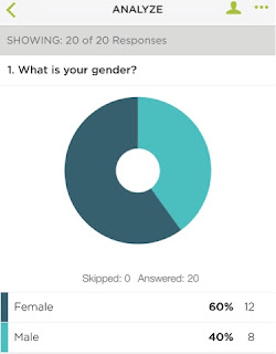
Our Research into Target AudienceBefore the filming of our opening sequence we researched into our genre and target audience. For our target audience research, we created a questionnaire that asked about conventions that our audience liked about the horror genre. We aimed to use all of the conventions that our target audience enjoyed in our opening sequence. We conducted this primary research by using an app called 'Survey Monkey', this app allowed us to post out questionnaire onto social networking sites, we decided to use Facebook & Twitter. By doing this, we knew that we would be able to reach our younger target audience, since social media sites are more popular amongst these people. Our questionnaire was taken by more females than males, which is good for our findings, since we felt our target audience was lent more towards females since our main character is female.We found that the age of the majority of people who answered our questionnaires were the same age that fell into our target audience's age.
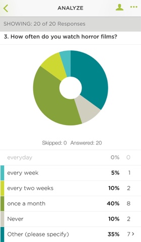
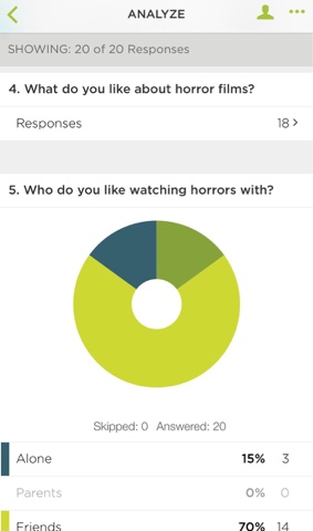
This was ideal for us, since we managed to gain relevant information to help to improve / create our media product to suit our target audience. We found that...


Overall our results were useful. However we felt that we could have made our questions more specific in order to gain more specific answers, this would have enabled us to avoid getting useless and inappropriate responses.


    Sunday, 24 January 2016

    Evaluation 2


    Created by Devyani 

    Evaluation 1

    Evaluation 1

    In what ways does your media product use, develop or challenge forms and conventions of real media products?

    (Georgina)

    Opening sequence conventionsas researched before, include:
    • Title of film
    • Credits featuring cast, directors, editors
    • Introduction to setting
    • Introduction to Main Characters
    • Studio Logos of Company 
    • Soundtrack and Ambient sounds
    • Narrative Enigma
    Horror Genre Conventionsas researched before, include:
    • Eerie Soundtrack
    • Low Key Lighting
    • Vulnerable Characters
    • Editing techniques
    • Settings
    • Long Shots
    As a group we tried to incorporate all the conventions of a opening sequence. Using the examples we analysed we were able to identify and apply it into our own opening sequence.
    Title:
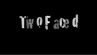
    The title of the film is priority in the opening sequence to allow the audience to get an insight into what they films about. Its also a major indicator to represent the genre of the film. The slightly distorted letters create an eerie atmosphere and the jumpy of the letters are conventional to a horror genre. 


    Credits:
    As stated above opening sequences usually contain credits throughout featuring the cast and editors. We decided to feature the credits on a black screen at the start of the piece. This is because we wanted the audiences to focus on the footage rather than reading the credits. Instead of stating all the names in the group we found it was easier just show the names and not have any explanation to what they did as we all shared the workload. This challenged the conventional opening sequence credits but due to the horror genre we found it was effective. The font is conventional to the horror genre as its looks old and mysterious.
     
    Setting:
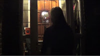
    Instead of showing the whole setting like other opening sequence we decided to show a little part where Ophelia walks up to the door. This creates a mystery adding to the narrative enigma of our piece holding the audiences attention. The low key lighting with the main light focus of the door compares Ophelia's two sides and she is coming out of darkness to become a normal human within her home.
    The settings of a conventional horror film usually are based in isolated areas with no protection putting the victim in danger. We decided to follow this convention and have the setting in an abandoned dark alleyway allowing the audience to sympathise with the victim and make them want to find out who did it.
    In comparison the kitchen/dining room setting is the complete opposite with many people gathered around acting like the perfect family. In addition the bright lighting exposes everyone which is ok until Ophelia is shown thinking showing her distorted mind.

    Institution:
    To be able to give credit to the institution its essential to include their names into the opening sequence. The distorted word is a play on which relates to her state of mind adding the horror genre. Having the letter twist also adds an tense atmosphere as the audience will be focused on the movement anticipating something is going to happen. 
    Camera:
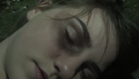
    The camera work in horror films scenes are very shaky due to them being in the point of view of the actor. We included these hand held shots to represents the situation of the girls mind. It also created enigma within the audience to whose behind the camera and why. Camera shots are varied with close ups of lily's face to show the damaged caused gaining the audiences sympathy. This is usually used in horrors to represent the victim. The tight frame adds to this sympathy as it makes her look more vulnerable.
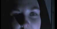
    Additionally, we used long shots (which are conventional in horror genre) when showing the body in the alley representing how alone and isolated she is.
    Props:
    The conventional prop in a horror is usually a knife or weapon that is used to represent a killing or murder. The constant showing of the knife allows the audience to engage with it and connect the two scenes together creating more narrative enigma.
     
    Colours:
    Colour is the visual iconography that helps convey the genre. Red and black are the main colours that are conventional in representing the horror genre due to the significance of danger. The main colours we included were black and white as the contrast symbolise the innocence within the danger of the characters. In addition the red velvet cake conveyed the power and danger within the red  that Ophelia is containing inside.
    Characters:
    The most vulnerable characters in horror films are females. This is because they are stereotyped as the weaker sex and make the easiest victims. We chose to follow this convention and have our victim as a young women.
     
    Sound:
    The soundtrack in horrors are usually very slow and eerie made out of classical instruments. Our soundtrack is conventional but unconventional. The music we used was a hush which was eerie and slow creating tension. To add to this tension we added a heartbeat which is very low then increases creating anticipation within the audience as they wait for something to happen. Its also very mysterious as it builds up with the dramatic irony griping the audience.
    This soundtrack was played throughout and on the party scenes it acted as a contrapuntal sound which showed that Ophelia was distorted throughout.
    There was little dialogue in our opening sequence just like other horror films because it build up tension and allows the audience to concentrate of the visual images engaging them more.
      
    Editing:
    Our opening sequence is unconventional as jumps cuts are used when editing most horror films. We preferred to miss this out of our opening sequence due to the quick and panic atmosphere it gives off. We decided to build the tension up slowly instead to edging the audience to make assumptions and engage better with the characters. This is why we chose to uses cross dissolves as it transfers them slowly and naturally.
    In contrast to this our editing is very fast pace with a lot going on throughout the montage. This delivers information that will make the audience feel on edge and wanting to watch more.
    Slow motion is usually only used in romances or actions to look more special and stand out. However we developed this and added it into our horror opening sequence to show the impact of the knife and allow the audience to catch on to the knife being the same. Getting the audience involved creates dramatic irony which excited them wanting to carry on watching.

    Narrative:
    Identifying the killer in the first 2 minutes of the film is very usual in the horror genre. As a group we decided to reveal the killers identity to the audience as it helps them understand the two sides of
    her personality. The contrast of family and murder scenes represents the differences and creates enigma within the audience so revealing the killer answers these questions but ends up creating more.
    Theories:
    Overall we have tired to include most of the horror genre conventions however as Steve Neale suggests a genre is not something static and always evolving so we have tried to push the boundaries and include some unconventional elements to engage the audience further.
    In addition most horror films use Rick Altman's genre theory to convey their conventions and we used more of the syntactic element to convey ours than semantic elements as we wanted the audience to feel more emotionally involved and sympathetic.


    Friday, 15 January 2016

    Editing- Finalised Credits

    Credits

    After tidying up our final piece, we ended up using the programme Livetype to create a more tidier version of our production logo 'Distorted Pictures' and our title 'Two Faced'.

    New Production Logo

    We feel this ties in well with our piece, also moving statically on the screen representing the horror genre. We also kept the blue colour as it is the production logo and isn't an actual part of the piece. 


    New Title

    This is very similar to our actual title however we have made it move around the screen to coincide with the climatic music.


    Wednesday, 13 January 2016

    Group Evaluation Of Our Rough Cut


    Rough Cut


    Best Bits:
    • The Montage: The montage  flows well with the music and heartbeat sound effect
    • Props: The significance of the knife is clearly shown and the red velvet cake has an impact and represents the blood from the knife.
    • Natural: One of the best things watching the rough cut is the way the characters seem involved. It makes it look more natural and the atmosphere is better due to Ophelia standing out.
    Things We Need To Improve: From watching our rough cut we realised a few areas need to be improved. For example:
    • Re-filming parts: We noticed that some of the clips in the cut are not as professional as they could be. This will make our whole opening sequence look bad. The part that is most noticeable is when Isla comes through the door, she is slightly smirking which when you notice it its unnoticeable.
    • Syncing the music: The 'Happy Birthday' does not match up the characters mouths. Channing this is  a effective way to make it look more professional.  
    • Pace of the clip: It moves to fast! Each clip looks as if its been cut off and doesn't have the impact we want it to have.
    • Credits: We need to add credits to the start. This will make it more like a opening sequence.
    • Effects: We need to add an effect on some of the shots to create a more distorted atmosphere. Using colour correlation and making the shots darker will help balance and create an eerie atmosphere.

    Shooting Day 3- Tidying up

    Day 3

    We decided to go back and re-film certain sections of our opening sequences as we were in the tidying up stages of our opening sequence so wanted to use our time wisely.
    Video created by Zack


    Editing- Credits

    Credits

    After we finished creating our opening sequence we decided to play around with the credits and choose a font which coincides nicely with our title and production logo. We chose quite a simple one however we feel it portrays the horror genre effectively whilst also creating narrative enigma.


     After working out how to add credits to our piece and being able to move it, we decided on this font in the end which we put over a black background not a clip as it is unusual and flows nicely integrating our piece. We used cross fades at the end and beginning of each text to flow more effectively.


    Preview
    Opening Credits


    End Credits

               
    I feel the end credits climax's brilliantly with the music increasing at just the right time for the title to dissolve on. Next lesson we plan on working out how to make the title bigger with no grey outline and box around the text.

    Audience Feedback- Rough Cut


    Rough Cut Evaluation

    During our lesson we filmed two people to see their views on our rough cut and help us to see what we could improve on.


    Editing


    Editing

    Whilst trying to edit recently, the computers have been having issues and crashing etc, however, my group and I have been coming back in our own times (after school and at lunch) to ensure that we are getting the work done before the deadline. By doing so we are allowing time to tidy the whole piece up and working on the improvements said through the audience feedback we collected.


    As a result, we are finding editing quite an easy process however quite long due to computer issues which were out of our control. Overall, we are working really well as a team, constantly giving different ideas on what to do and trying various concepts out to find the best suited. The major problem we have is getting the sound matched up to the different clips and flowing the volume to make it sound better. After adjusting the clips the backing music of the heartbeat makes an eerie atmosphere which is useful when creating a horror opening sequence.
    The best part to editing is watching it back and seeing the improvement it makes with just a little transition or a effect.